Fork in the Road Case Study
Fork in the Road
Case Study Details
Fork In The Road - Farm to Table Grocery App
My Role: Designer & Researcher
Tools used: Figma, Adobe After Effects, Adobe Illustrator
Responsibilities: Researching user needs to create helpful micro-interactions
This project focused on creating interactive micro-interactions for a mobile grocery shopping app. It includes research on existing apps to study
micro-interactions and user experience patterns. The goal was to apply these insights into a functional and interactive app
design later on in development!
Fork in the Road
Project Background
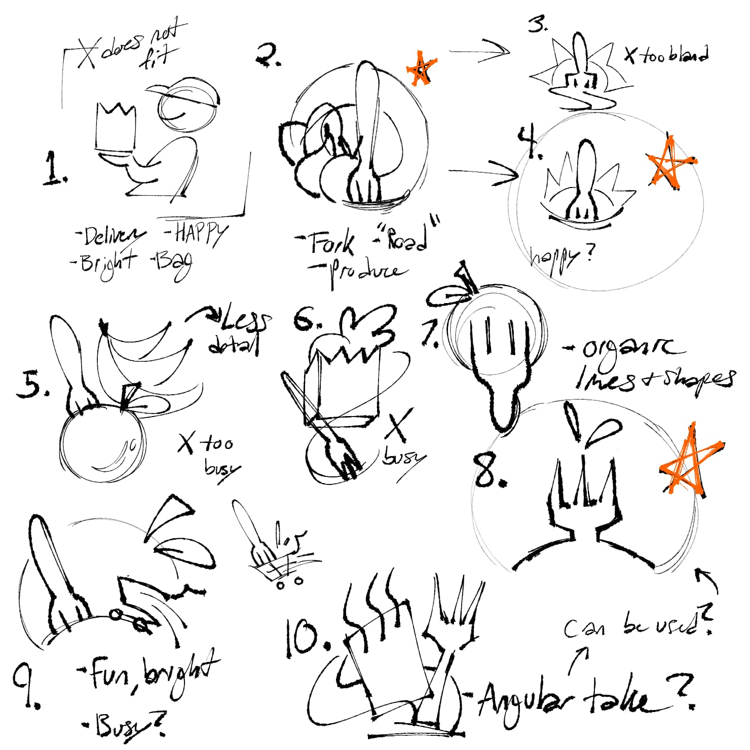
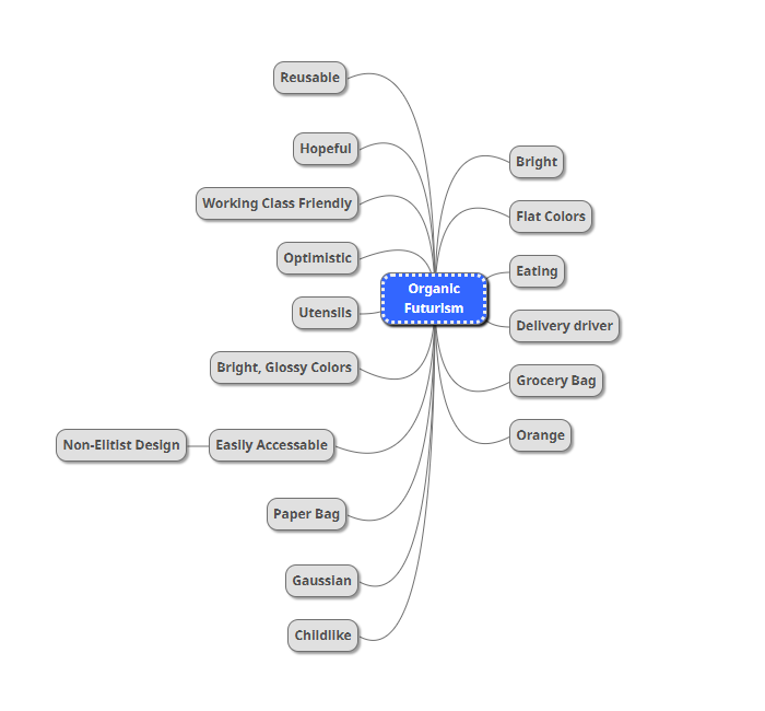
The Situation: This simple home page design was created as a starting point for a local business, but stakeholders complained about how the the app felt static, making the overall brand feel unreliable. Stakeholders requested an app that feels modern and organic, but not sterile. The goal was to create a more engaging and interactive experience that would make the app feel more dynamic and enjoyable to use. I conducted research on commonly used apps to understand how micro-interactions improve usability.
Fork in the Road
The Task At Hand
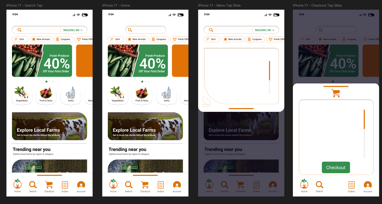
My task was to prototype small animations in Adobe XD and After Effects, such as through interaction with the shopping card or navigating to the search bar. The process involved sketching, wireframing, and prototyping to create a functional and engaging animation to pair with haptics and sound design in the future. I considered using button-tap feedback and visual momentum inspired by video game consoles from the 2000's to improve usability and engagement.
Fork in the Road
Action Plan
Further iterations incorporated subtle micro-interactions like tap animations, swipe transitions, and animated menus. Keeping the layout simple and focused on key features to avoid distractions was a main priority. For example, a swipe gesture was added to the shopping cart icon for easy access, and buttons were designed with bounce effects to provide tactile feedback. Search bars would expand when focused on to reveal needed information only when needed at that time.
Fork in the Road
Feedback & Results
Users during testing would benefit from immediate visual feedback, such as button animations and responsive transitions. Features like swipe navigation and interactive menus made the experience feel smoother and more intuitive. After a few rounds of testing, I discovered that users could benefit from a more simplified layout that could fit on various screen sizes, so a more mobile-friendly design was prototyped and tested in Figma upon the stakeholder's request. The client was able to see their brand visualized in a more cleaner way, and the micro-interactions added a layer of polish that made the app feel enjoyable to use, letting them walk away with a stronger vision for their brand.